


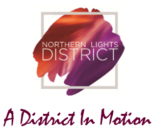
- Art:
- The artwork behind this design is to symbolize the famous northern lights, or Aurora Borealis.
- The artistic design of this logo was important in the design process, due to a significant art role in the district (Princeton’s mosaics, artwork at the Sharonville Convention Center, and new artwork at the hotel).
- Color Selection:
- The orange and purple hues represent the warm and hospitable atmosphere of Sharonville.
- The blending of colors represents the many industries that operate in the district such as hospitality, education, corporate offices, retail stores and more.
- The colors chosen for the Northern Lights District were to compliment the Sharonville Convention Center and Princeton High School
- Font:
- Clean, contemporary, sophisticated to resemble the new modern architecture
- The logo is distinctive, unique, vibrant, and modern.
- Shape:
- The border of this logo is to show that while we do have city limits, we like to think outside the box.